CS21 Lab 8: Presidential election results
For this lab you will write one program, election.py, that plays displays the results from any of the U.S. presidential elections between 1960 and 2012. In the U.S., elections for President happen every 4 years.
First, run update21, if you haven't already, to create the cs21/labs/08 directory. Then cd into your cs21/labs/08 directory and create the python program for lab 8 in this directory
For this lab we will continue using the Zelle graphics library. You will continue to work on top-down design by first designing your program and then writing your program using multiple functions.
This lab writeup will take longer to digest than any that we have seen so far in CS21. We recommend that you read it through at least twice before writing code. On the first read, get an overall idea of the scope of the lab. Don't worry if particular details don't make sense. On the second read, pay more attention to details like how the election data is represented.
Although individual U.S. citizens vote for the person they would like
to be president, the votes are tallied on a state-by-state basis. In
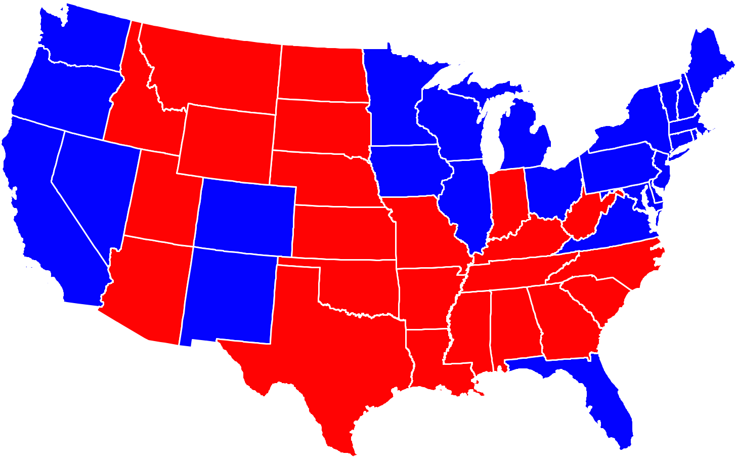
recent years, it has been common to display the results of elections
using a map of the country where each state is colored red if the Republican candidate got the most votes
in that state, or blue if the Democratic
candidate got the most votes in that state. This has led to maps of
the U.S. that look something like this:
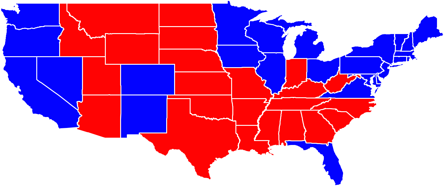
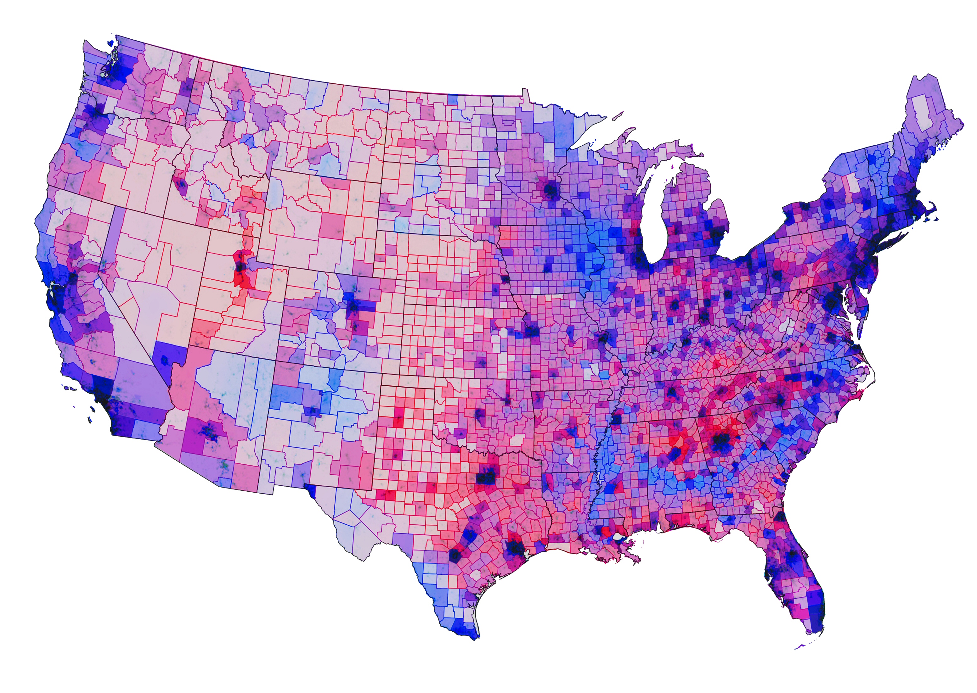
Critics have said that this coloring of the map has a polarizing
effect on American politics because states are either red or blue. In reality,
the differences can be much more subtle. For example, in the map
above, Florida is colored in blue. However,
the tally of votes for Obama (the Democrat) and Romney (the
Republican) differed by only about 75,000 votes out of the nearly 8.5
million votes cast. Perhaps it would be better to color Florida in
purple:
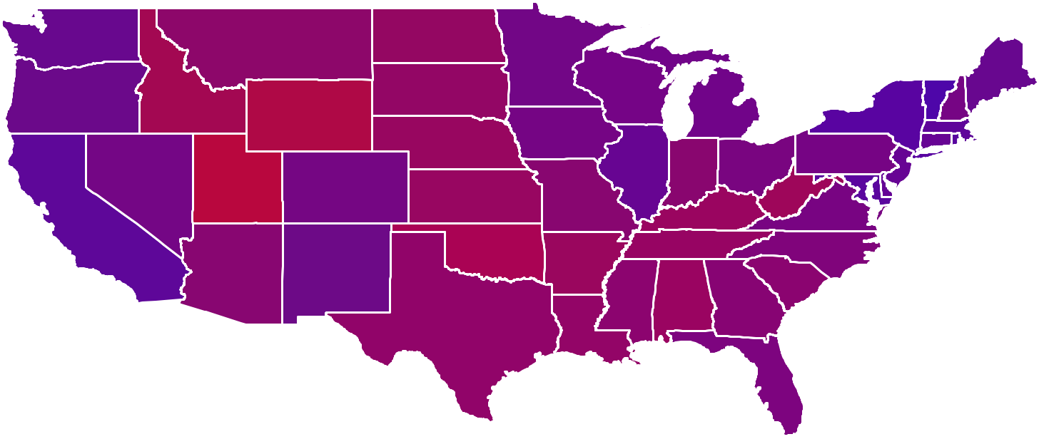
Another problem with coloring the whole state either red or blue is that it
hides regional differences within a state. In the original red/blue
map above, Pennsylvania is colored entirely in blue. However, focusing on just Pennsylvania, we
can see that on a county-by-county basis, the results are far from
homogeneous:
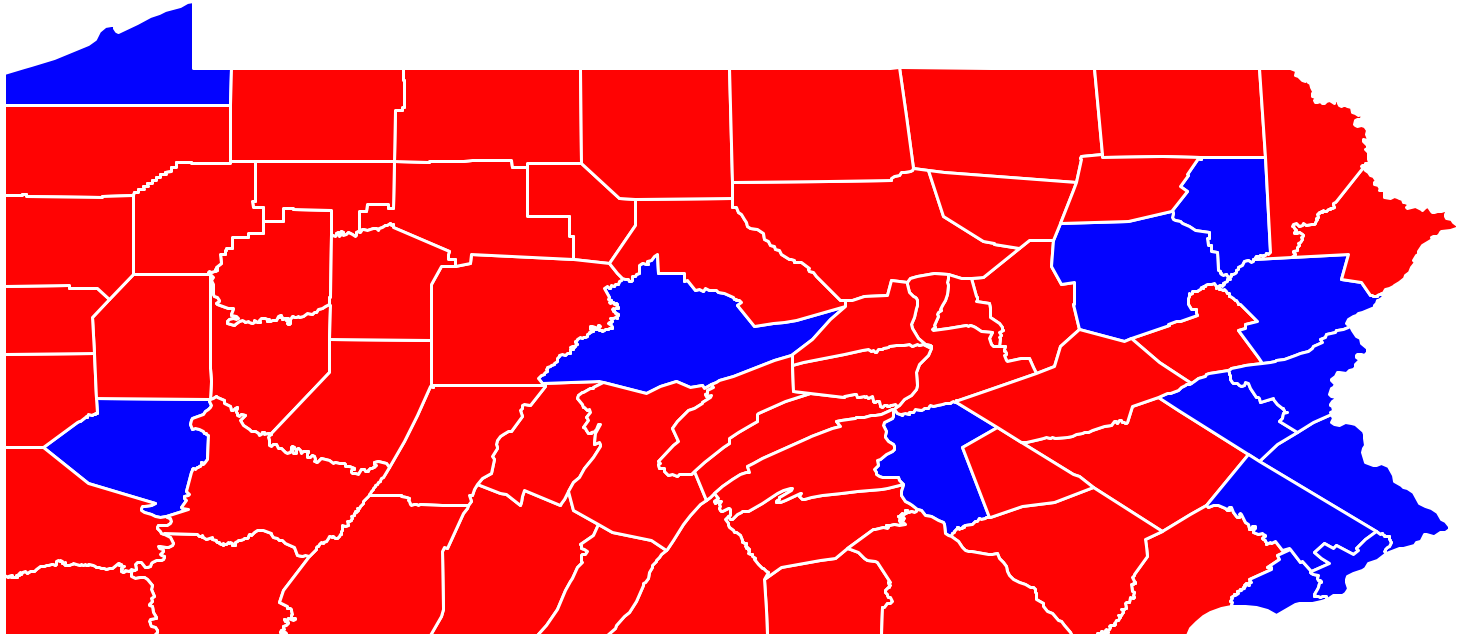
From this map, you might wonder how Obama got more votes than Romney in Pennsylvania. Of course, just like with states, it might be a better idea to color individual counties purple instead of red or blue. (It's also the case that densely-populated urban areas like Philadelphia tend to vote for Democrats at higher rates than rural areas, but counties are colored the same regardless of the population of the county. If you're interested, you can explore this idea in Extension 3 below.)
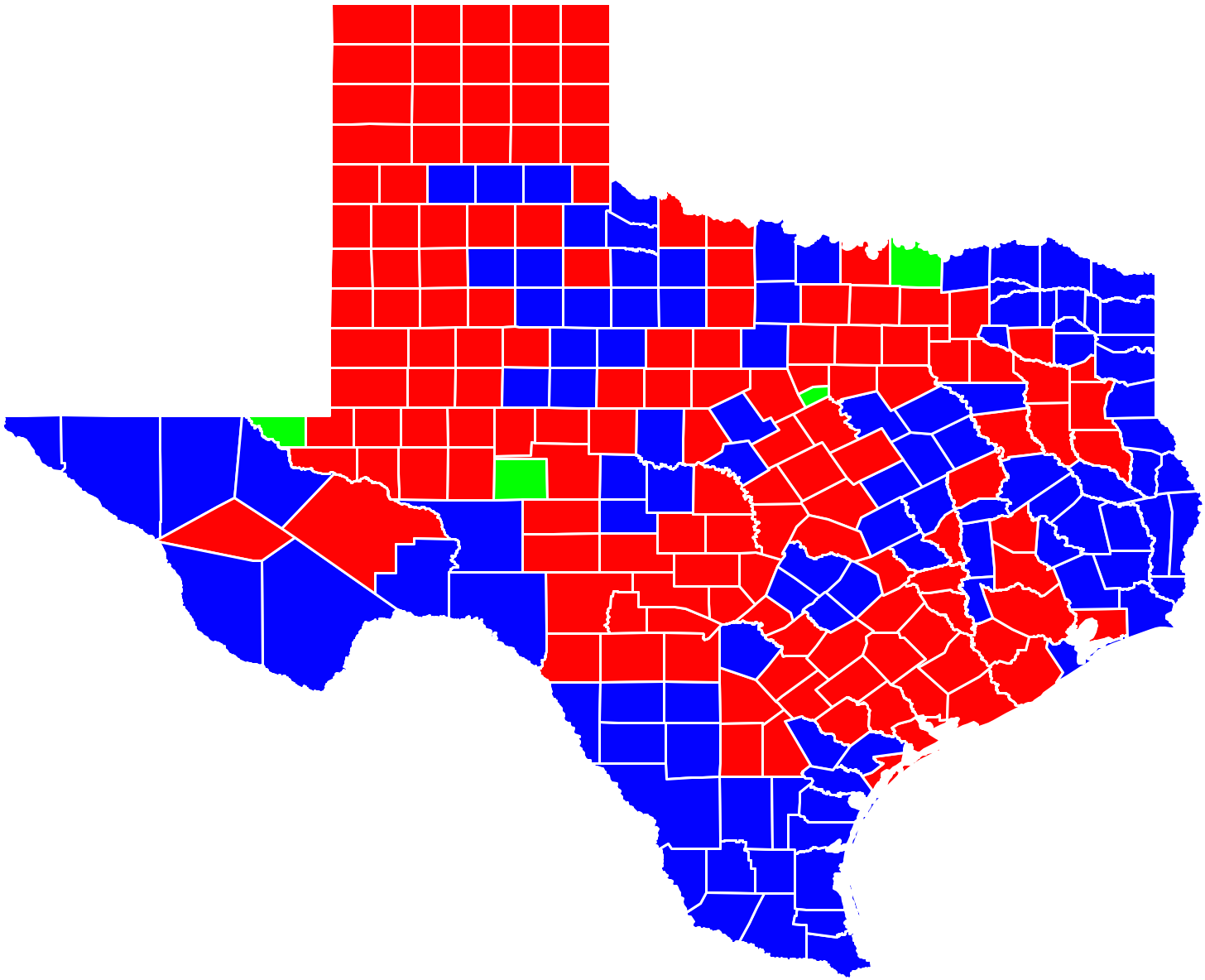
Although it hasn't happened since 1992, sometimes a third party candidate gets more votes in a county than either the Republican or the Democrat. When this happens, counties end up getting colored green. Here is what Texas looked like in 1992 when Ross Perot was a strong enough candidate to beat both Bill Clinton (Democrat) and George H. W. Bush (Republican) in four counties:
For this lab, you are given files that contain the geographic boundaries of every county in the continental U.S. (The continental U.S. excludes Alaska and Hawaii.) In addition, you are given files that contain the election results from each of those counties. The geographic boundaries will allow you to create a Polygon for each county. The election results will allow you to determine the color that you will fill each Polygon. Once you have both the Polygon and the color, you can draw that colored Polygon on the screen.
Boundary data
First, let's look at the file containing the county boundaries. In this example, we're looking at the boundary data for Iowa which can be found in /usr/local/doc/election/boundaries/IA.csv. Each line of the boundaries file contains the name of the county, the name of the state, and then a list of longitude and latitude values that make up the boundary of the county. For example, here is the 41st line in the file that we can see is describing Hancock County, Iowa:
Hancock,IA,-93.9702,43.255222,-93.49733,43.255436,-93.498421,42.908478,-93.971352,42.90773Hancock County, like many counties Iowa, is quite rectangular. To create the Polygon that represents Hancock County, we first make a list of all the Points that make up the boundary of the county. Then, we can create a Polygon out of this list of Points:
points = [Point(-93.9702,43.255222), Point(-93.49733,43.255436),     # <-- continues on next line
          Point(-93.498421,42.908478), Point(-93.971352,42.90773)]
boundary = Polygon(points)
For each line in this file of county boundaries, you will need to
convert the line of text into a Polygon. Then, you can represent an
entire state simply by storing a list of each of the county polygons
that make up the state.
Note that Hancock County, Iowa has only 4 vertices and looks a lot like a rectangle. Many counties are more geometrically complex than Hancock Country. For example, Delaware County, PA, the county that Swarthmore is in, has 80 vertices. However, the process to create the Polygon for Delaware County is the same. First, make a list of the 80 Points that make up the boundary of the county and then use that list to make a Polygon.
Some counties are so complex to draw that they require multiple Polygons. For example, Knox County in Maine requires 4 Polygons since the county consists of part of the mainland of Maine as well as 3 small islands. Each of those pieces requires its own Polygon. When this happens, the same county is simply listed multiple times in the file. For example:
Knox,ME,-69.409927,44.328011,-69.405075,44.332733,-69.409531,44.336269,...
Knox,ME,-68.903091,44.123016,-68.903648,44.126747,-68.910233,44.130341,...
Knox,ME,-68.656723,44.002834,-68.657021,44.010918,-68.661804,44.016304,...
Knox,ME,-68.880531,43.843479,-68.876175,43.836208,-68.888252,43.820145,...
There's nothing special you need to do to handle this, however. Don't combine the Points for each of the four pieces of the county. Simply create a Polygon for the first line, a Polygon for the second line, etc. and store each of them separately in your list of Polygons as if they were completely different counties.
Like the Iowa boundary file, each state's boundaries can be found in a file named by the two-letter abbreviation for the state. The file for Pennsylvania (PA) is located here:
/usr/local/doc/election/boundaries/PA.csvSimilarly, the file for Iowa (IA) was located here:
/usr/local/doc/election/boundaries/IA.csv
Results data
Next, let's look at the file containing the election results. In this example, we're looking at the 2012 election results data for Iowa which can be found in /usr/local/doc/election/results/IA2012.csv. Each line of the results file contains the name of the county, the name of the state, and then the vote totals for the Republican candidate, the Democratic candidate, and any votes that went to other candidates. For example, here are the 2012 election results for Hancock County, Iowa:Hancock,IA,3317,2521,87
We see that Romney (the Republican candidate) won 3317 votes, Obama (the Democratic candidate) won 2521 votes, and 87 votes went to candidates other than Romney or Obama.
When we read in the boundaries for the counties, we stored a list of the Polygons that represented each county in the state. Similarly, we'll want to store a list of the results for each county in the state. To do this, we'll create a list of lists. For example, given this snippet from the Iowa election results:
...
Hamilton,IA,3991,3782,154
Hancock,IA,3317,2521,87
Hardin,IA,4670,4075,153
...
we would create a list like this:
[ ..., [3391, 3782, 154], [3317, 2521, 87], [4670, 4075, 153], ... ]
Like the state boundaries, the results for each state can be found in a file named by the two-letter abbreviation for the state and also the year of the election. The file for the 2012 Pennsylvania (PA) election is located here:
/usr/local/doc/election/results/PA2012.csvSimilarly, the file for New Jersey's 2012 results is located here:
/usr/local/doc/election/results/NJ2012.csvAnd the file containing New York's 1964 results are here:
/usr/local/doc/election/results/NY1964.csv
Combining the data sources
In our red/blue coloring scheme, we would want to color Hancock red because more people voted for Romney than for Obama in Hancock County.
How does our program keep track of this fact? The two files (the file of boundaries and the file of results) are kept in the same order. This means that since the Polygon describing Hancock County will be the 41st Polygon in your list of Polygons, then the voting results for Hancock County will be the 41st entry in your list of results. So, for each Polygon stored at index i in your list of polygons, the voting result for the county represented by that Polygon can be found at index i in your list of results.
There is one interesting side effect to note here. Recall that in the discussion of the county boundaries we said that some counties require multiple lines? Knox County, Maine is the 13th, 14th, 15th, and 16th line in the file of county boundaries for Maine. This means that the 13th, 14th, 15th and 16th line in the file of results for Maine must also represent Knox County, so the results for the county are simply duplicated over four lines.
Here are lines 12-17 in both files that help demonstrate how this works:
RESULTS FILE                  | BOUNDARY FILE
------------                  | -------------
...                           | ...
Kennebec,ME,26519,35068,1910  | Kennebec,ME,-69.931046,44.610741,-69.853653,44.621433...
Knox,ME,8248,13223,596        | Knox,ME,-69.409927,44.328011,-69.405075,44.332733...
Knox,ME,8248,13223,596        | Knox,ME,-68.903091,44.123016,-68.903648,44.126747...
Knox,ME,8248,13223,596        | Knox,ME,-68.656723,44.002834,-68.657021,44.010918...
Knox,ME,8248,13223,596        | Knox,ME,-68.880531,43.843479,-68.876175,43.836208...
Lincoln,ME,8899,11315,543     | Lincoln,ME,-69.507278,44.342785,-69.435364,44.331985...
...                           | ...
At a minimum, your program should allow the user to enter the abbreviation for the state they want to draw (e.g. PA, NJ, NY) and the year they want to see the election results for (e.g. 2012, 1960). Your program should draw all of the counties in the state colored either red, blue or green, depending on who won the county. The state should be drawn into a window that is appropriately shaped for the state you are drawing.
Your program should be designed well, with multiple functions, each completing a logical piece of the whole program following the principles of top-down design.
To receive the maximum score on your lab, however, you must also allow the user to specify whether they want to see counties colored using the winner-takes-all red/blue/green format described above or if they'd like to see what the country looks like if you shade the counties according to the percentage of the vote each candidate got. If you have variables republican, democrat and other storing the total number of votes they they won in a particular county, you can use the color_rgb function to generate a color for that county as follows:
 total = republican + democrat + other
 color = color_rgb(255*republican/total, 255*other/total, 255*democrat/total)
- Think about the data structures you are using as you design the program. When you read in the boundaries from a file, you'll be creating a list of Polygons. When you read in the results from a file, you'll be creating a list of lists. Which functions will you design to create these data structures? Which functions will need these data structures as parameters?
- Incrementally test your code. Write placeholder versions of all the functions you plan to implement that just return some constant value. As you work through the lab you will fill in the functions with working implementations. But you should always be able to run your program without it just plain crashing because some function is not defined.
- Along the lines of incrementally testing your code, you may want to first see if you can draw all the counties in a state filled in with white. This will allow you to see if the picture is showing up properly before continuing with the colors for the state.
- When drawing the Polygon for a state, you'll notice that the
longitude values are negative. If you try to draw the Polygon directly
into a GraphWin, nothing will show up. You can fix this by using the
setCoords function that you used in last week's lab. You should
compute the minimum and maximum longitude and latitude and use those
values in setCoords. This will allow you to draw the latitude and
longitude values directly into the window. For example, if the state
was Pennsylvania, you might want:
win.setCoords(-80.519974,39.719799,-74.690163,42.269817)
NOTE: If you have difficulty computing the minimum and maximum values for each state, you can read in these values from /usr/local/doc/election/border.csv. If the user wants to display Pennsylvania, just read through this file until you find the line that starts "PA". - When creating the initial GraphWin, you'll want to make sure the window is the right shape for the state. California is more than two times taller than it is wide. Pennsylvania is about two times wider than it is tall. Drawing a square window for both will make the picture look really strange. How can you use the min/max values to figure out reasonable dimensions for the window?
- You'll need to open the file of boundaries and the file of
results. You can use string formatting to help you locate these files:
 boundary_filename = '/usr/local/doc/election/boundaries/%s.csv' % (state)
 result_filename = '/usr/local/doc/election/results/%s%d.csv' % (state, year)
- You can validate states by checking to see if the
boundary_filename is actually a file on the disk. To do this, put import os at the top of your file where other import statements are located. Then, you can ask questions like this:
if os.path.exists(boundary_filename): print "This file exists!" else: print "This file doesn't exist." - Drawing lots of state counties can be slow unless you give the
graphics library a special command that tells Python not to display
anything on the screen until everything is done being drawn. To do
this, simply add autoflush=false to the end of the line where
you create the GraphWin:
win = GraphWin(title, xsize, ysize, autoflush=False)
- Once you get it working, your program should also allow you to draw the whole country with every county in it simply by typing US instead of a state abbreviation. The file format is identical and you shouldn't need to change anything at all in your program to make this work. However, it is slow to draw the whole country, so test on individual states first. You can also try entering "US-states" instead of "US" to see a map that doesn't include county boundaries similar to the one at the top of the page.
- Why do people insist that Republicans are red and Democrats are blue? Try out some alternate color schemes.
- Instead of using the formula above for creating purple colors, use a set of 5 colors or 7 colors, similar to this map (source). For example, you could use deep red to indicate elections where Republicans won by a big percentage, you could use pink to indicate elections where Republicans won by a small percentage, you could use grey to indicate incredibly close elections, light blue for small Democratic victories, and deep blue for large Democratic victories.
- Many geographically large counties have small populations, whereas many geographically small counties have relatively large populations. For example, Philadelphia County comprises only 0.3% of the land area of the state but contained nearly 12.5% of the voters in the 2012 election. Can you come up with a color scheme that helps highlight this while also showing the election results?
- The map we've drawn for the whole US looks a bit strange because
it isn't using a map projection,
so the northern part of the US looks stretched out. You can use an
equal-area projection to make this look better. To do this, you can
use the pyproj module:
from pyproj import Proj
Then, you need to make a list of all the longitudes and a corresponding list of all the latitudes. Then you can do something like this:longitudes = ... #you compute this latitudes = ... #you compute this projection = Proj(init='esri:102004') xvalues, yvalues = projection(longitudes, latitudes)
The new lists xvalues and yvalues can get turned into a list of Points, which in turn can get turned into a Polygon. If you want to do this, you'll need a way of calculating the boundaries for setCoords yourself. When you're done, the resulting maps will look more "normal". - You can draw a map showing the net change in votes from one election to the next.
- You could make your program do a slideshow from one election to the next, showing how voting patterns have changed over the years.
- For state maps, you can try putting the county name in the center of the Polygon. For the whole US map, you can try putting state names in the center of the Polygon. Perhaps you want to do this only for large counties/states?
- You can go find other data online and show that instead of election results. For example, you maybe you could find average rainfall, altitude, poverty rates, obesity rates, linguistic variations (e.g. "soda" vs "pop" vs "coke") or anything else you'd like.
You may run handin21 as many times as you like, and only the
most recent submission will be recorded. This is useful if you realize,
after handing in some programs, that you'd like to make a few more
changes to them.