CS21 Lab 11: Classes, Chemistry Data Analysis
This lab is due Thursday, Dec 9, before midnight.
This is a 13 point lab.
Goals
-
gain experience writing classes!
-
apply computer science skills to help Professor Riley analyze chemistry data.
This lab will use the Zelle Graphics Library, so please review the objects in that library.
1. Chemistry Data Science
For this lab you will write a program to help professor Kathryn Riley analyze data that measures the dissolution of silver nanoparticles.
You will not need to understand chemistry to complete this lab, but it might be helpful/interesting to understand where this data is coming from and what chemists want us to do with the data set.
1.1. Riley Lab Research
Research in the Riley Lab involves analyzing engineered nanomaterials, which are materials that are precisely designed to have at least one dimension between 1 and 100 nanometers. For reference, 1 nanometer is almost 1 million times smaller than the width of a single human hair! These materials are very small! When a material is that small, it can behave differently than its larger scale counterpart. For example, while you might describe a silver watch as a gray metal, solutions of silver nanoparticles can be yellow, red, or blue depending on their size and shape. Despite their small size, scientists have found ways to easily “tune” the size and and shape of nanomaterials, which has enabled their use in a wide range of fields like energy technologies, electronics, medicine, and consumer products.
In our lab, we study silver nanoparticles, which have excellent antimicrobial and antibacterial properties. Specifically, we develop experimental methods to measure the dissolution of silver nanoparticles, which is quite literally the dissolving of the solid metal nanoparticle into silver ions. The dissolution process is very important to the antimicrobial and antibacterial properties of silver nanoparticles. To study dissolution, we use an instrument to measure the silver ions that are released when the nanoparticle dissolves. Our measurement results in a graph that has a single peak. The area of this peak is proportional to how many silver ions are in solution, so our data analysis relies on the accurate calculation of the peak area. The challenge of our experiment is that we collect as many as 200 data files in one day, all of which contain a single peak that needs to be integrated. Thus, having a streamlined data analysis program to perform peak integrations is critical to the efficiency of the experimental work in our lab!
Here is a video of Professor Riley discussing her research program.
1.2. Chemistry Data Analysis for CS21
Again, you do not need to understand Professor Riley’s research (or any chemistry at all!) to complete this lab assignment. What you do need to know is:
-
The input is a file representing several curves. Each curve represents a single experiment.
-
You will create a Curve class to capture the output of each experiment.
-
Your program will need to graph these curves using Zelle graphics.
-
You’ll also need to measure the peak area of a curve. From a computer science perspective, "measuring peak area" amounts to measuring the area between a curve and a baseline curve. To estimate the area between two curves, you’ll use a technique called Riemann Sums. See below for more information on how to compute Riemann sums.
2. Scientific Notation
Scientific notation is a useful way of writing very small numbers. The number 4.64E-07 equals 4.64 * (10**(-7)), or 0.000000464. The number to the right of the E (in this case -07) indicates how many places to shift the decimal point to the left or right.
The chemistry data sets contains many numbers written in scientific notation. These numbers are very small e.g., 2.046E-15. Before working on the chemistry data part of this lab, it will help to get comfortable using scientific notation.
Fortunately for us, python treats these like floats!
$ python3
>>> x=1.23E-06
>>> type(x)
<class 'float'>
>>> x
1.23e-06
>>> x*100
0.000123
>>> x*(10**6)
1.23
>>> print("%f" % x)
0.000001
>>> print("%.10f" % x)
0.0000012300
Before creating your Curve class and analyzing Professor Riley’s
chemistry data, open the file scientific.py, write a short main
program that asks the user for two numbers expressed in scientific
notation, then prints out the numbers and then their sum. Print the
numbers using 15 decimal places to ensure you can verify the output is
correct.
Here are some examples (user input bolded):
$ python3 scientific.py
Enter number 1: 1.23E-06
Enter number 2: 2.22345E-07
   0.000001230000000
 + 0.000000222345000
--------------------
   0.000001452345000
$ python3 scientific.py
Enter number 1: 4.56E-12
Enter number 2: 3.33E-10
   0.000000000004560
 + 0.000000000333000
--------------------
   0.000000000337560
3. The Curve() Class
The data in the chemistry data set consists of a series of curves. Let’s make a Curve object that contains of a list of (x,y) points.
I would like to be able to create Curve objects, add points to a Curve, and draw a Curve object similar to other graphics objects in the Zelle library.
We’ve given you a sample testing program in curve.py. As you
implement methods in your Curve class, uncomment portions of the
main program and make sure the output produced is what you expect.
Here is a link to the sample program.
Below is the documentation for the Curve class. Below we have help
and documentation for each method in the class. Please write each
method and test it thoroughly before moving on to the next.
| constructor/method | description |
|---|---|
|
creates and returns a |
|
converts the |
|
draw the curve to the given window |
|
set the tile color |
|
add an (x,y) Point to the Curve |
|
return the i-th Point on the Curve |
|
return the number of Points on the Curve |
|
get the smallest x-value of any point on the Curve |
|
get the largest x-value of any point on the Curve |
|
get the smallest/largest y-value of any point on the Curve |
|
creates and returns a baseline Curve for this Curve. The baseline curve will have the same points as the Curve we call |
3.1. Write the constructor
Start by editing the curve.py file adding your __init__() method.
As shown above, we want to be able to create a Curve object by
specifying no arguments. However, that doesn’t mean the Curve objects
will have no attributes! All curve objects should have at least two
attributes (more if you want): a List of Point objects, and a string
representing the curve’s color. Initialize the List of Point objects
to be empty initially, and set the color to be black by default. Like
other Zelle object construcors, the Curve constructor just creates an
object, but doesn’t draw it.
3.1.1. Test the constructor
Once you have your constructor written, you can test that there are no
syntax errors. It won’t do much until you add points, but in the
meantime, your program should run without crashing. Here’s a simple
main() program with an example call to the constructor that
shouldn’t cause a crash:
def main():
  curve = Curve()

if __name__ == "__main__":
  main()
Uncomment the constructor in the test code we gave you in the Curve
class, and run your program. You should be able to run without crashing.
3.2. Write and test the __str__ method.
The __str__(self) should return a string representing the Curve
object. You have some freedom in what information this string should
contain and how it looks, but at a minimum, the string you return in
this method should contain (i) the number of points in the string,
(ii) the color of the Curve, and (iii) at least five of the curve’s
points if it has them.
This method enables you to "see" data contained in a Curve object and might be helpful when you’re debugging your code.
Test this method by uncommenting the line in the sample code that prints out the curve object you created. The test program should now run and print out basic information about a Curve object that contains no points.
Printing a Curve object will call __str__ to convert the object
into a string it can print. For now, this printed output should say
that the Curve object contains zero points, since you haven’t added any!
3.3. Write and test the add_point(x,y) method.
A Curve object is really made up of a list of Point objects, so
this method should create a new Point object with coordinates (x,y)
and color the same as the color of the Curve object. Then,
add_point(x,y) should append this new point the curve object’s list
of points.
Test this method by uncommenting the lines in the sample code that add points to the curve object you created.
The test program should now run and print out basic information about
a Curve object that contains no points, then print out information
about the Curve representing f(x) = x^3 - 15x now that you’ve added
some points.
3.4. Write and test the getter and setter methods.
One of the remaining methods corresponds closely to a Zelle graphics method:
-
set_color(color)should set the color of theCurveobject tocolor. It should also change the color of eachPointobject.
The remaining methods are getters that get information from the List of Points:
-
get_num_points()returns the number of Points in theCurve. -
get_point(i)returns the i-th Point in the Curve. -
get_min_xreturns the smallest x value of any point on theCurve. -
get_max_xreturns the largest x value of any point on theCurve. -
get_min_yreturns the smallest y value of any point on theCurve. -
get_max_yreturns the largest 7 value of any point on theCurve.
Write all six methods and test them! See the sample code for examples on how to test these methods.
You can assume that the user only calls get_point(i) or
get_min_x(), get_max_x(), get_min_y(), or get_max_y() when the curve
has at least one point, and that the user gives a valid index for
get_point(i).
3.5. Implement and test the draw(win) method.
Since a Curve object is really a list of Points, to draw a Curve
object, all you need to do is draw each point in the list.
You should now have enough to actually see a Curve object!
Uncomment the line in the
example code
that draws the Curve object you’ve been creating to see it drawn.
Hint: Use setCoords to set the coordinates of the graphics window
in a way that the points on the curve are in the graphics window. In
the example code, I set the y value of the
upper right corner to be 1.2*ymax instead of ymax to add a bit of
vertical space above the maximal value in the curve.
3.6. Implement the get_baseline() method.
In order to analyze the chemistry data set, you’ll need to measure the
area between a curve and a baseline curve. This method will create
a simple baseline curve for this purpose. The baseline curve should
have the same number of points as the origional curve. The x values
of the points should be the same as in the origional curve. However,
we’ll replace each y value with the maximal y value in the original
curve. To summarize, the get_baseline() method should:
-
Identify the largest y value in the curve. Call this
ymax. -
Create a new
Curve objectcalled e.g.baseline. -
For each point
(x,y)on the curve, add a point(x,ymax)tobaseline. -
Return
baseline.
After implementing this method, you can test it by uncommenting the lines in the example code to get a baseline curve and draw it onto the window.
Once you’ve implemented and tested get_baseline(), you’re ready to
write your chemistry data analysis program!
4. Analyzing Chemistry Data
Now that you have implemented and tested your Curve class, you are
ready to write a program to analyze Professor Riley’s chemistry data.
Your task is to write a program chemistry.py that:
-
Reads in the data set from a file, storing it as a list of Curve objects. The data is stored in
/usr/local/doc/chemdata/large.tsv.Here is a link to a tiny data file with the same format as
/usr/local/doc/chemdata/large.tsv. The file format is structured as follows. The first line contains two integers: N and M. N is the number of curves in the data set, and M is the number of points in each curve). At this point construct a List of N curve objects.The file contains M more lines. Each of these lines contains information about a single point for each curve.
x y0 y1 y2 y3 y4 ... yN-1
The first number on the line represents the x value. The rest of the numbers represent y-values for one point for each curve. For example, to process the line above, you should add point (x, y0) to Curve 0, the point (x, y1) to Curve 1, the point (x,y2) to curve 2, and so on, until you add the point (x,yN-1) to curve N-1. In this way, each line after the first line in the data file generates one point for each curve in the data set.
To summarize, to load a data set from a file, you should
-
load the first line of the file to determine N and M.
-
create a list of N Curve objects. At this point, each Curve will have zero points.
-
For the next M lines of the file:
-
read in one line [x, y0, y1, …, yN-1] of the file.
-
for each Curve i, add the point (x, yi) to the curve.
Hint: Earlier in the semester you saw how to read lines in from a file. You’ll need to treat the first line in this file differently from the other lines. Use a Boolean variable to keep track of whether or not the current line you’re reading in is the first line of the file.
-
-
-
Prompts the user with a menu of 4 choices:
Please select one of the following choices:
(1) Graph Curve
(2) Graph Baseline
(3) Compute Peak Areas
(4) Quit

Choice?
Depending on the user’s selection, you will prompt them for additional information and then perform one the selected action. More details on the requirements of each feature lie below.
Here is a link to sample output for chemistry.py. Compare this output to the output your program produces as you develop this portion of the assignment.
4.1. Graph Curve
For the first option (Graph Curve), you must:
-
Prompt the user to select a curve. The curve must be in the range 0…(N-1), where N is the number of curves. Keep prompting until the user selects a valid curve.
-
Create a graph window object, and draw the selected curve onto the window.
Hint: Use setCoords(xmin,1.2*ymin,xmax,1.2*ymax) to make the curve
fit in the window, where xmin,ymin,xmax, and ymax are the extremal
points in the curve. I use 1.2*ymin and 1.2*ymax to add some
vertical space above and below the curve.
4.2. Graph Baseline
For the second option (Graph Baseline), you must:
-
Prompt the user to select a curve.
-
Call the
get_baseline()method on that Curve object -
Create a graph window object, and
-
draw the baseline and the curve on that window.
Draw the selected curve in blue and the baseline in red.
4.3. Computing Peak Areas using Riemann Sums.
For the final option (Compute Peak Areas), you should loop through the
list of Curve objects.
For each curve, you should:
-
Call
get_baseline()on the curve to grab its baseline curve. -
Measure the area between the curve and the baseline curve using Riemann Sums. Hint: implement a function that takes two curves and returns the area between the curves.
-
Print out the area between the curves. (When printing the area, use the same formatting that you used in
scientific.py— that is, print to fifteen decimal places with a formatting code like %.15f)
The "peak area" of a curve is the main measure of interest for Professor Riley’s chemistry data analysis. Without knowing more about the curves, it is impossible to exactly compute the peak area. However, using a technique called Riemann Sums, it is not difficult to get a close approximation.
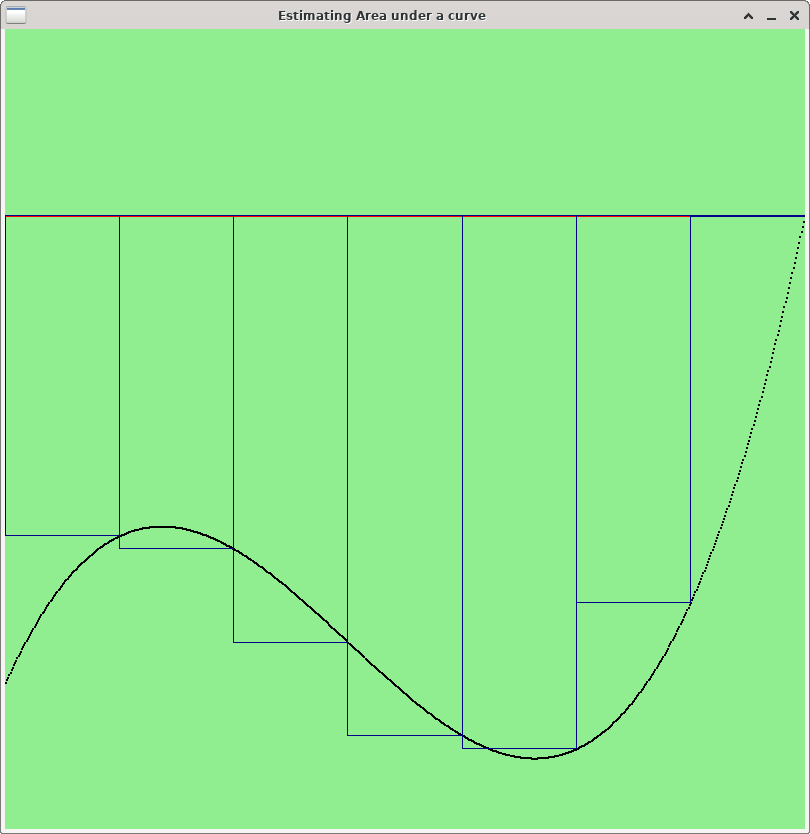
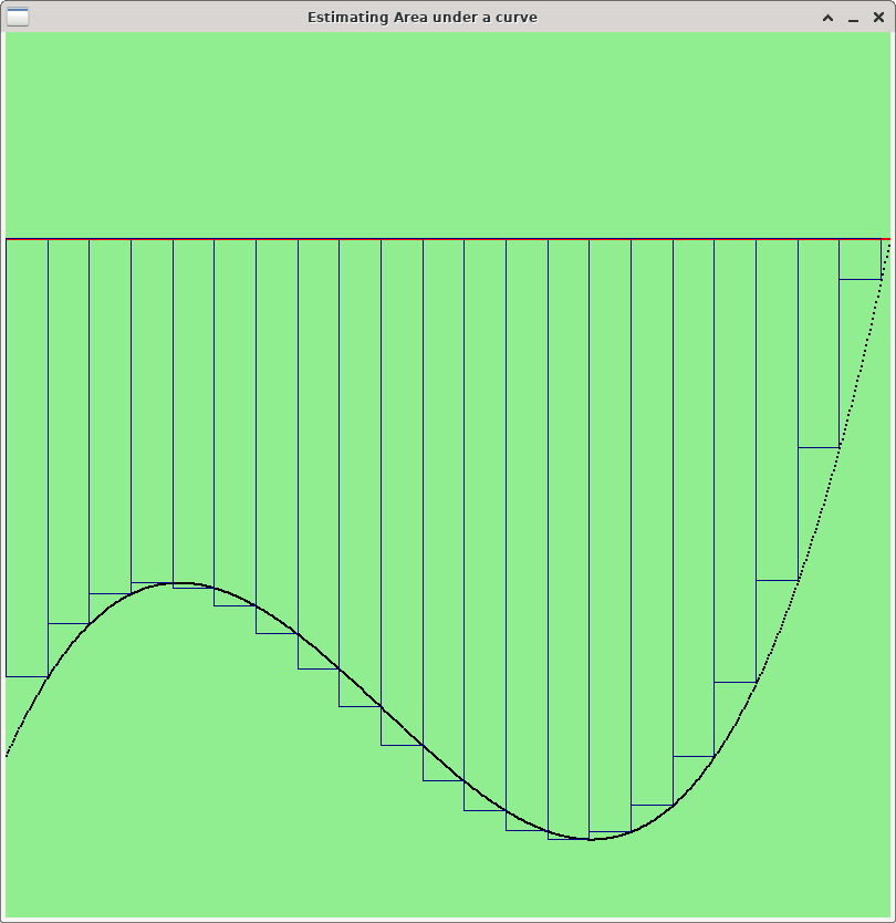
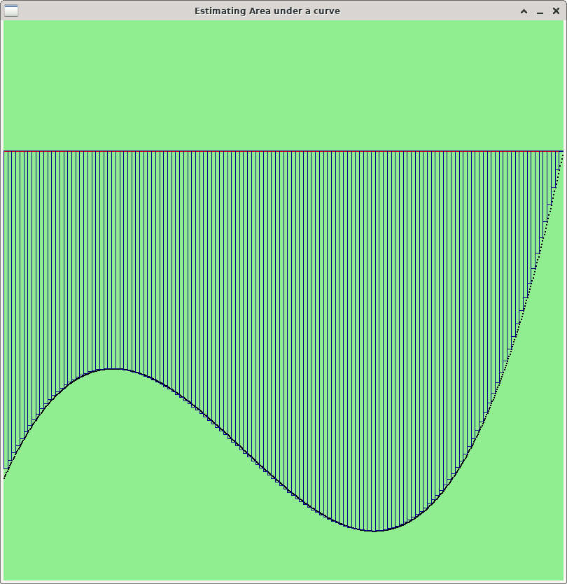
Riemann sum works by dividing the area under between two curves into a number of disjoint rectangles, whose total area is close to the area under the curve that you wish to estimate. Each rectangle will approximate some region of the area between the curves. Using a small number of rectangles will give you a coarse approximation of the area. Using more (but smaller) rectangles will give you a closer approximation. The more rectangles you use, the closer the approximation will be.
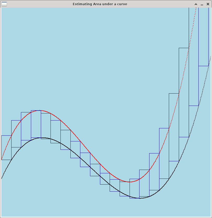
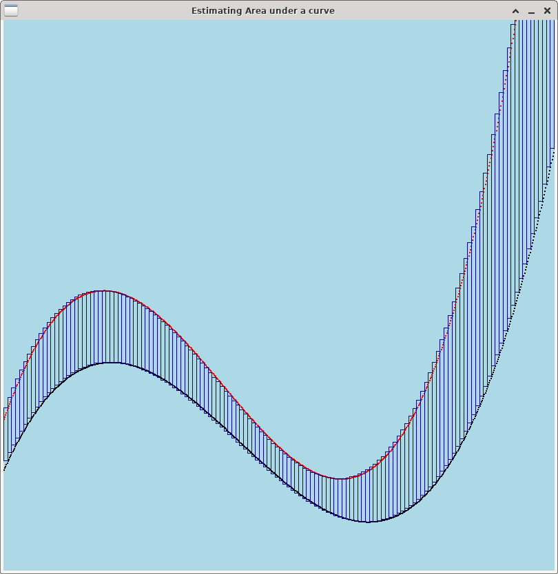
Below are three images showing how to use Riemann Sums to estimate the area between a curve (in black) and a simple horizontal line like the naive baseline curve (in red). Note that the more rectangles you use, the more accurately you capture the area between the curves.
For Lab 11, you should use as many rectangles as possible --- one rectangle per point on the curve. Specifically, to measure the area between a curve (x0, y0), (x1, y1), …, (xk, yk) and a baseline curve (x0, z0), (x1, z1), …, (xk, zk), create k rectangles. For i=1,…, k, rectangle Ri will be a rectangle whose lower right point is (xi, yi) and whose upper left point is (xi-1, zi-1). Thus, the width of Ri is |xi - xi-1|, and the height of Ri is |yi - zi|. To estimate the area between two curves, all you need to do is compute the area of each rectangle and add them up. Below is some pseudocode to do the computation.
-
For each rectangle
-
compute the width and height of the rectangle. The width of rectangle Ri is |xi - xi-1|. The height of Ri is |yi - zi|.
-
compute the rectangle’s area: area = width * height
-
add the area of this rectangle to an accumulator variable.
-
Hint: python has a built-in function abs(x) for computing the
absolute value of a number x.
$ python3
>>> abs(-4)
4
>>> abs(8-22)
14
To summarize, when the user selects Option 3, your program should do the following for each curve in the dataset:
-
get the baseline curve
-
compute the area between the curve and its baseline
-
print out the area to fifteen decimal places
See these examples for sample output.
5. Optional Extra Credit: Add a feature that graphs multiple curves.
Many of the curves in Professor Riley’s data set have similar shape, and it can be interesting to visualize how the shapes change on different curves.
Add a feature to your program to prompt the user for multiple valid curves. Then draw them on the same graph window. Use different colors for each curve.
6. Optional Extra Credit: Constructing a more accurate baseline curve.
For Professor Riley’s research, it’s important to get an accurate estimate of the "peak area" of the curve. The peak is the portion of the curve that dips low. Where this peak area is differs on different curves, as does the intensity of the peak i.e., how much the curve dips.
Using Riemann sums to estimate the area between the curve and its baseline is a good approach for estimating peak area, but the baseline curve we’ve created is naive. It would be very useful to generate a more sophisticated baseline curve.
Note: once you create a baseline curve that more closely captures peak area, you can use this better baseline curve and the techniques you’ve already developed to get a better estimate of the area.
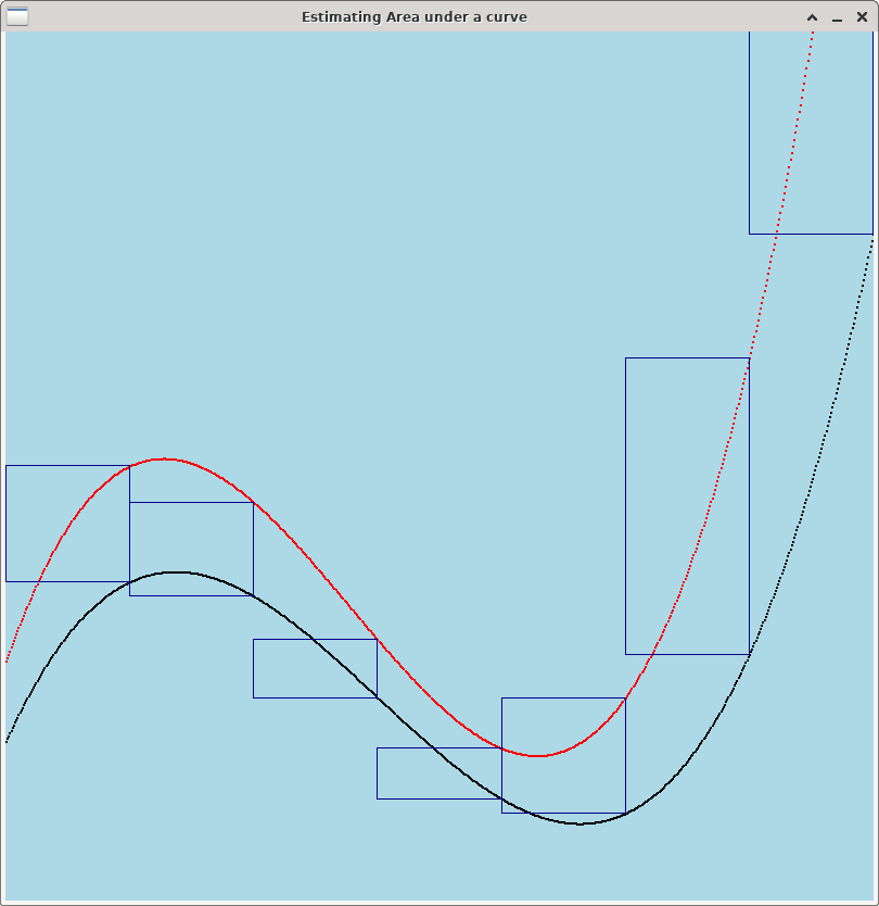
Riemann Sum is a good technique for estimating the area between two curves even when neither curve is a simple horizontal line. Below are three images showing how to use Riemann Sums to estimate the area between a curve (in black) and a more sophisticated baseline (in red). As with the previous example, more rectangles gives you a better estimate of the area between the curves.
If you want to complete this optional extra challenge, your tasks are:
-
Add an additional function
get_better_baseline()to your Curve class. Likeget_baseline(), this function should create and return another Curve object. -
Modify Option 2 (graph baseline) to prompt the user to select which baseline they want to use. Then, get the appropriate baseline curve and graph the original curve and its baseline.
-
Similarly, modify Option 3 (compute areas) to prompt the user to select which baseline they want to use. Then, for each curve in the dataset, get the baseline for that curve and compute the area between the curves. If you designed your code well, computing the area between the curves shouldn’t require any additional code on your part --- just supply the better baseline instead of the naive one.
Here is one suggestion on how to design a better baseline function. The idea is to have the baseline curve have the same points as the original curve, except in a region centered around the peak.
-
identify the index of the point on the curve with the smallest y value. Call this index
i. -
let
left = i-50. If (i-50 < 0), letleft = 0. -
Let
right = i+50. If (i+50 >= M), letright = M-1. -
For each
(xj, yj)point in the curve, add a point(xj, zj)to the baseline, where:-
if j is outside the region [left, right], i.e. if (j < left) or (j > right), let zj = yj.
-
otherwise, "interpolate" between the points
(xleft, yleft)and(xright, yright): setdy = yright - yleft,D = right-left. Then, set
-
zj = yleft + (j-left)*dy / D
7. Answer the Questionnaire
Please edit
the Questions-11.txt file in your cs21/labs/11 directory
and answer the questions in that file.
Once you’re done with that, run handin21 again.
Turning in your labs…
Remember to run handin21 to turn in your lab files! You may run handin21
as many times as you want. Each time it will turn in any new work. We
recommend running handin21 after you complete each program or after you
complete significant work on any one program.
Logging out
When you’re done working in the lab, you should log out of the computer you’re
using. First quit any applications you are running, like the browser and the
terminal. Then click on the logout icon ( or
or
 ) and choose "log out".
If you plan to leave the lab for just a few minutes, you do not need to log
out. It is, however, a good idea to lock your machine while you are gone. You
can lock your screen by clicking on the lock  icon.
PLEASE do not leave a session locked for a long period of time. Power may go
out, someone might reboot the machine, etc. You don’t want to lose any work!
icon.
PLEASE do not leave a session locked for a long period of time. Power may go
out, someone might reboot the machine, etc. You don’t want to lose any work!